Opening credits are to introduce the narrative of a film; in some films the beginning of the film is added to make the audience understand what is going to happen in the film; it shows us what genre it is going to be; It will show the audience this by the design of the Credits for example for a thriller film the credits would normally be Bold with red or black writing, Red will show the audience that blood is going to be involved which will then make the audience realise that death will also be involved. The opening credits will make the audience see information on the film and about the characters, due to the way their name of the opening credits appear to be. The production team shows the audience what the genre of the film is going to be for instance if the production film was going to be PIXAR it will show the audience that the film is going to be a Disney film.
When watching the opening credits for the film Seven; there was Jumpy credits this was presented by using a flickering effect of each credit; this is conventional to the thriller genre as it will make the audience see that the film will be jumpy. Throughout the opening credits their is tension building music such as loud thudding to scare the audience and drums; these sounds will be associated with a loud heart beat thud, which will create a relationship with the audience as it makes them wonder what will happen in the upcoming sequence. The colours of the opening sequence match the convention as there's one killer that kills the people, the white represents the innocence and the black represents the evil in the opening credits. Within the opening credits their are hints of red- which will be associated with danger,pain,blood. This again shows the audience that something bad is going to happen. Throughout the opening credits there's pictures of the victims; hiding their identity, this creates an enigma as you don't fully know who the victims are. Within this you can see certain iconography such as a weapon of a blade which shows the audience that this could be one of the key iconography that could create the murders in the film. Not only does the opening credits make it easier for the audience to understand but it shows the audience who the Director is; this makes the audience understand what the film is going to be like. The credits of the film starts of with the production of the film; the production team; the actors; the producers and finally the director.
Within my opening credits; I had a black layout for the background which represents death that will happen in the film, also it will associate with misery which is relevant within my sequence as the girl is going through an emotional dilemma such as bullying and being belittled. The font of my credits are red which will show the audience that blood and pain is going to be involved, the credits for my film title and the film production slowly slide past each other which creates tension for the audience as the attention is focused on the film title which has hints as to what the film is going to include. With this I ensured that I followed the conventions of a thriller as the font colours are the main colours used in a thriller sequence opening credits. However even though my font is white, I would change it to red as white isn't that conventional to the thriller genre. With my credits they would slide past each other slowly, to build up tension to the audience, then when both of the credits meet they would pause to show the audience what the credits are saying. The credits movement all together is going to be slow as I'm trying to build up tension through my credits. I have chosen the film title as ' The untold events' as it creates a mystery as to what the untold events could possibly be, the film title alone creates an enigma as your unaware as to what the credits actually mean. Then the production of the film is a known production 'New lines Cinema'.
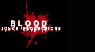
 Johns opening credits however is conventional as the font is used for the production, johns idea is also very unique but may be seen as cliché as it has the obvious colours and font which is normally used in other thriller opening credits but the way he's done it, is like he's own original version which is why it would be seen as unique. The opening credits is effective as it looks like blood dripping down the credits which is very conventional to the thriller convention. His background is white which will make the font of the credits stand out more as it stands out; due to the red colour. However even though this is a conventional idea it doesn't create a dark foreboding atmosphere and doesn't seem very sinister.
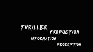
 Sasha's opening credits is based on the idea of the film seven it has the same similarities such as the way it's set out; its sharp and in your face which catches the audience attention, this could associate with the iconography of a knife as it's sharp which is conventional as a knife is a key element in a thriller. The colours is a mixture of black and white which could resemble the good from the evil; in this case the antagonist from the protagonist; so the killer and victim. However the only weakness from Sasha's idea is that it looks very basic so doesn't really have much sinister involved, to improve it there could be more darker colours to resemble the death that is going to happen. We have chosen Sasha's idea as it would create an effect on the audience as it portrays essential elements that would be seen as conventional for the opening credits. The text of this is what you would normally see for a thriller opening sequence for the credits; which shows it's conventional but may be seen a cliche. However this is why it works due to it being a very conventional text.
Overall with this planning I think that Sasha's idea is the most conventional as it catches the audiences eye straight away as it's straight away in your face with the sharp text; even though their is not much sinister involved the text draws that away by having an effective font for it. It also shows the audience what could possibly happen in the thriller sequence as it's separating the protagonist from the antagonist due to the use of colours being portrayed in the credits.


This post demonstrates some understanding of why credits are essential to include. You have made a start in considering the purpose of credits and the ways in which it was used in Se7en. You have made a start in analysing the points, but you need to explore how the credits are conventional to a thriller in more detail.
ReplyDeleteThis post also demonstrates some group planning. You have made a start in describing the strengths and weaknesses for each idea, but you need to ensure that you have included the images, to support the points that you have made.
Aim-
1) Explore your choices and decisions for selecting to use Sasha's idea in more detail
2) Include points to explain what your credits will say and where they will appear
3) Include images to support all the points that you have made